Chime, Wine & Dine
Chime opened in late 2014. The original building was left unoccupied and abandoned for over 10 years and has since been restored and converted into a vibrant and buzzing restaurant. I worked with the owners to create a structured, timeless brand suited to the area and its surroundings. I followed
the restoration project from start to finish, developing laser-cut menus, business cards, a website, signage, beer taps and mats.
I developed Chime's branding to reflect the history and heritage of the building. During the 1900's
the building had a bell on the side of the gable end, used as a warning to the village incase of fire or emergency. As you can see below, the original bell from the building was restored and put back in its original setting. It doubled as a iconic shape for the branding, adding personality and weaving the story of the building into the logo.
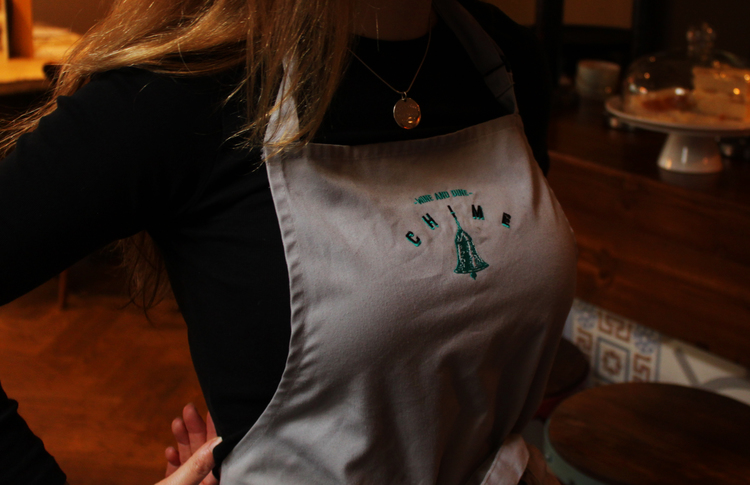
The Chime branding was hand drawn and developed digitally using the typeface liberator, I created a brand with longevity and balance, the arched letterforms help to compliment and attract attention to the centred bell Illustration. The branding took time to develop ensuring it would work across all possible platforms that might be used throughout Chimes growth.
Menus
The Menus were designed and constructed with laser cut covers, Bound with book binding tape and attached using hessian. The inner pages of the menu's were illustrated and designed to reflect Chime's rustic aesthetics, I really enjoyed the chance to sketch the wide variety of ingredients. The laser cutting process and development took a long time to perfect but came together in the end.
Below are the Inner sleeves of Chimes Menu's, These were printed on a matt laminate 220gsm stock, using minimal colours and following the guidelines I created for the initial branding. Click through the images below to see the full menu.
Below are the Christmas and NYE menu. Playing on the fact it was Christmas and the imagery associated with celebration the Chime branding was wrapped in Holly.
Below Is a video demonstrating the laser cutting process, This took time to achieve, experimenting with the depth of etching. Its mesmerising to watch!
Look Book
To showcase Chimes range of services, food and events we created the Chime Look Book. A short flick through magazine highlighting Chimes best qualities.
Staff Illustrations
Chime's construction was a lengthy process as the building had been left to rot for over a decade. To celebrate the beautiful job of the construction team involved the owners of Chime got me to illustrate their portraits.
These we then used as exterior adverts to give credit to the people behind the construction and foundations of the building.
Beer Pumps
As well as constructing the menu's and signage using the laser cutter as my main tool, I also used it to create a lot of the way finding and signage within the building. This stemmed to laser-cutting handmade wooden beer pumps for the different drinks available on tap.
Exterior
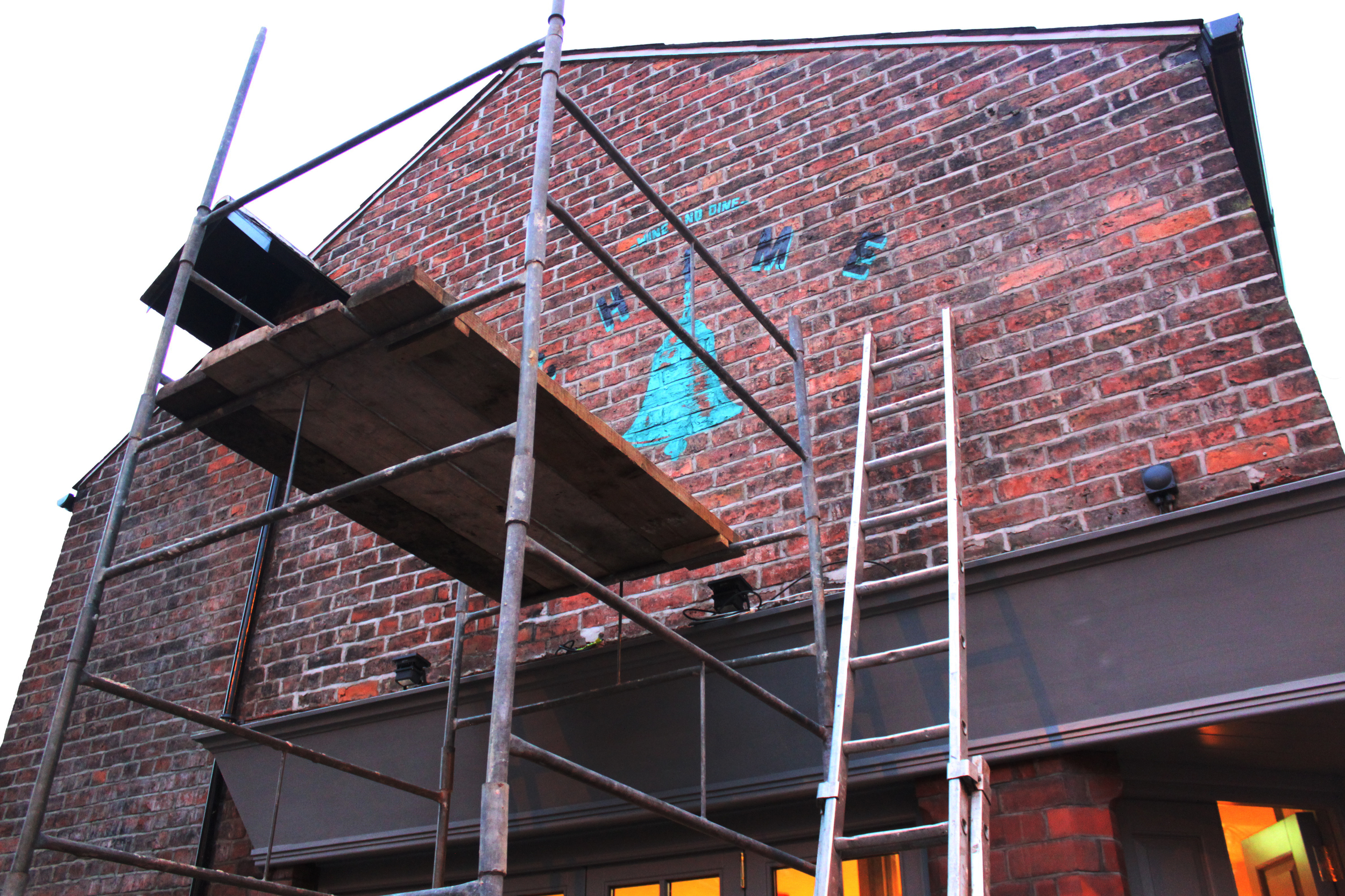
I stencilled the branding on the side of the building on both sides adding to the essence of early shop signage from the 1900's. When light up at night this really helps to draw attention to the building.
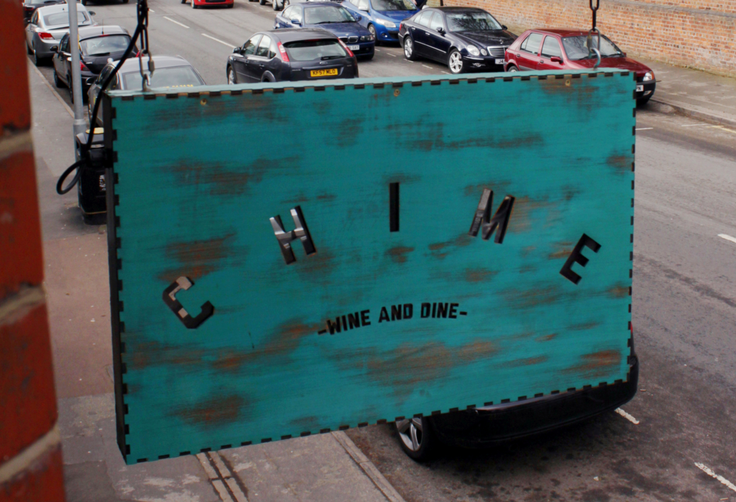
I constructed, built and installed all of the exterior signage. My design process stemmed from my love of laser cutting creating 3d letterforms using outdoor plywood, spray-paint and exterior varnish. The swinging sign was also constructed and cut on the laser-cutter, swinging from an old bracket I restored using a sandblaster. Distressing the wood using sandpaper and ageing techniques helped the sign to fit in with the aesthetics of the restaurant and vintage items found within the interior.
